Haven Health is a patient-centered primary care clinic focused on creating a calm, supportive experience from the very first interaction. The brand was designed to move away from cold, institutional healthcare visuals and instead feel grounded, modern, and reassuring—reflecting a clinic where patients are treated like people, not numbers.
SERVICES
| BRAND identity | WEBSITE | launch support |

haven health
haven health
SERVICES
| brand identity | WEBSITE | launch support |
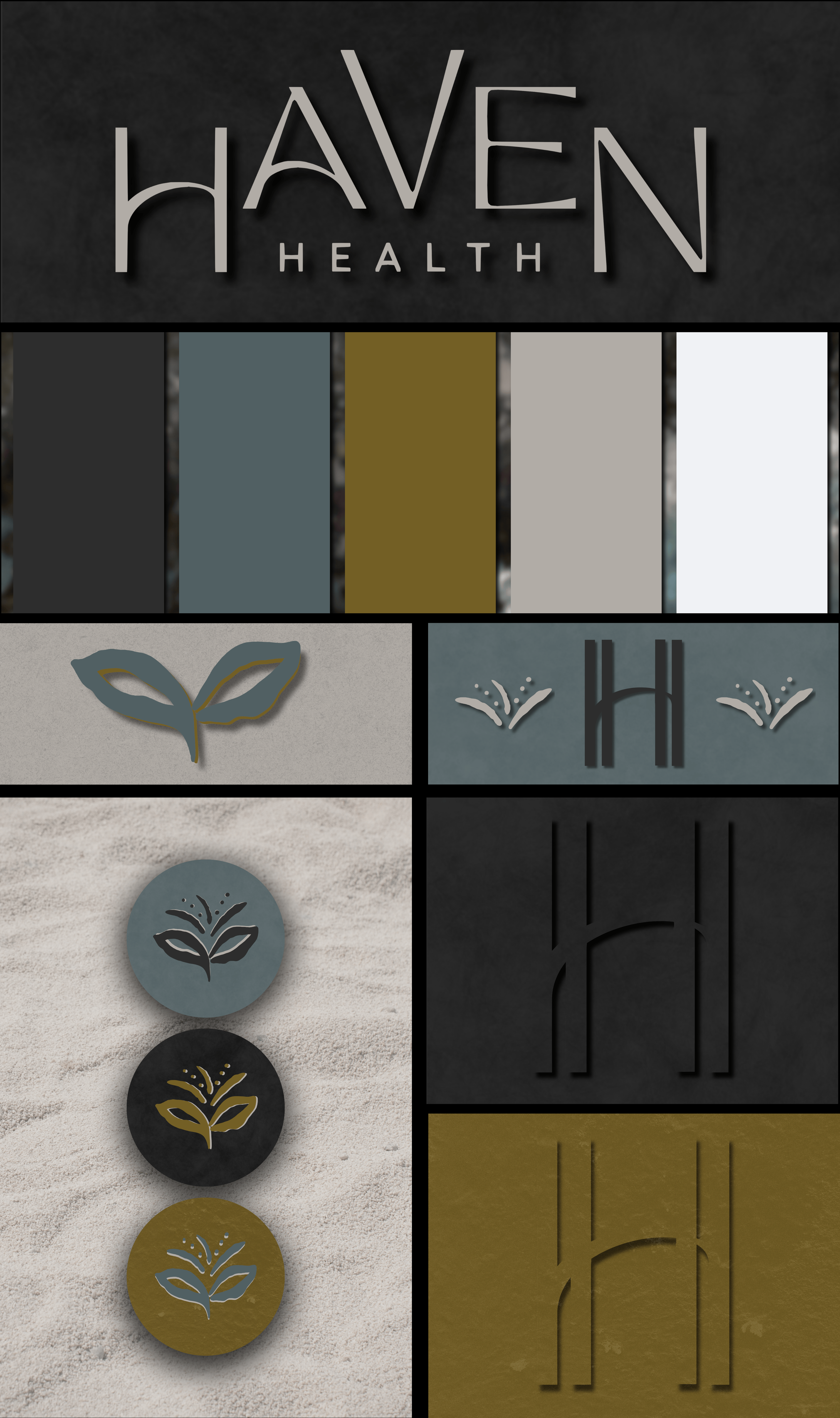
Haven Health is a patient-centered primary care clinic built around trust, clarity, and long-term relationships with the families it serves. This project included the development of a complete brand identity system—from custom logo marks and hand-drawn iconography to brand textures, patterns, stationery, and a supporting website concept. The goal was to create a visual presence that felt calm, modern, and reassuring while still maintaining the professionalism expected in a clinical setting.

DILLY DAHLE CUSTOM RODS IS A STARTUP BUSINESS BASED OUT OF PRESTON IDAHO - SPECIALIZING IN CUSTOM FISHING RODS.
Most small medical practices rely on predictable symbols like stethoscopes, crosses, or sterile blue palettes that feel impersonal and interchangeable. Haven Health needed a visual identity that communicated professionalism and trust while still feeling warm, steady, and approachable for families seeking long-term care.
wE BUILT:
• a custom primary logo and monogram mark designed to feel stable, balanced, and immediately recognizable across both print and digital environments
a hand-drawn icon set created to support patient communication, navigation, and educational materials without relying on generic medical symbols
a refined color palette developed to communicate clarity, warmth, and professionalism while avoiding sterile institutional tones
a custom brand pattern system designed to extend the identity across stationery, patient materials, and environmental graphics
a supporting texture library used to add depth and softness across digital layouts and printed applications
a business card suite aligned with the clinic’s patient-first positioning and long-term brand consistency
a website concept designed to create a simple, reassuring entry point for new patients while reinforcing trust through clear structure and visual cohesion
THE CHALLENGE


project outcomethe challengeHealthcare branding often defaults to generic symbols and sterile color palettes that make independent clinics feel interchangeable and impersonal. Haven Health needed an identity that communicated credibility without sacrificing warmth, and structure without feeling institutional.
The challenge was to design a flexible visual system that could support both patient-facing materials and digital experiences while avoiding overused medical imagery. The brand needed to feel grounded, welcoming, and trustworthy—something patients could recognize instantly and feel comfortable returning to over time.


project outcomeWe built a complete identity system designed to grow with the space as it evolved from café to creative community hub.
wE BUILT:
a custom primary logo and monogram mark designed to feel stable, balanced, and immediately recognizable across both print and digital environments
a hand-drawn icon set created to support patient communication, navigation, and educational materials without relying on generic medical symbols
a refined color palette developed to communicate clarity, warmth, and professionalism while avoiding sterile institutional tones
a custom brand pattern system designed to extend the identity across stationery, patient materials, and environmental graphics
a supporting texture library used to add depth and softness across digital layouts and printed applications
a business card suite aligned with the clinic’s patient-first positioning and long-term brand consistency
a website concept designed to create a simple, reassuring entry point for new patients while reinforcing trust through clear structure and visual cohesion