Hazel’s Roots is a backyard flower stand and seasonal farm-fresh goods brand created for a young grower learning how to turn dirt, creativity, and consistency into a small business of her own.
DILLY DAHLE CUSTOM RODS IS A STARTUP BUSINESS BASED OUT OF PRESTON IDAHO - SPECIALIZING IN CUSTOM FISHING RODS.
SERVICES
| BRAND identity | visual system | launch support |
hazel’s roots
HAZEL’S ROOTS
SERVICES
| brand identity | visual system | launch support |
Hazel’s Roots is a backyard flower stand and seasonal farm-fresh goods brand created for a young grower learning how to turn dirt, creativity, and consistency into a small business of her own.

Hazel’s Roots began as a simple backyard flower stand with big personality and even bigger potential. The goal was to create a brand that felt playful and approachable while still working like a real small business identity system.
Because the stand operates on an honor-system model and serves neighbors, families, and passersby, the visual identity needed to feel welcoming, trustworthy, and easy to recognize at a glance. At the same time, it had to reflect the energy of a young grower learning entrepreneurship through flowers, garden goods, and seasonal offerings.
The challenge was designing a brand that could grow alongside the stand itself—supporting everything from handwritten price tags and roadside signage to social media posts, packaging, and future farmers market expansion—without losing its handmade charm.
THE CHALLENGE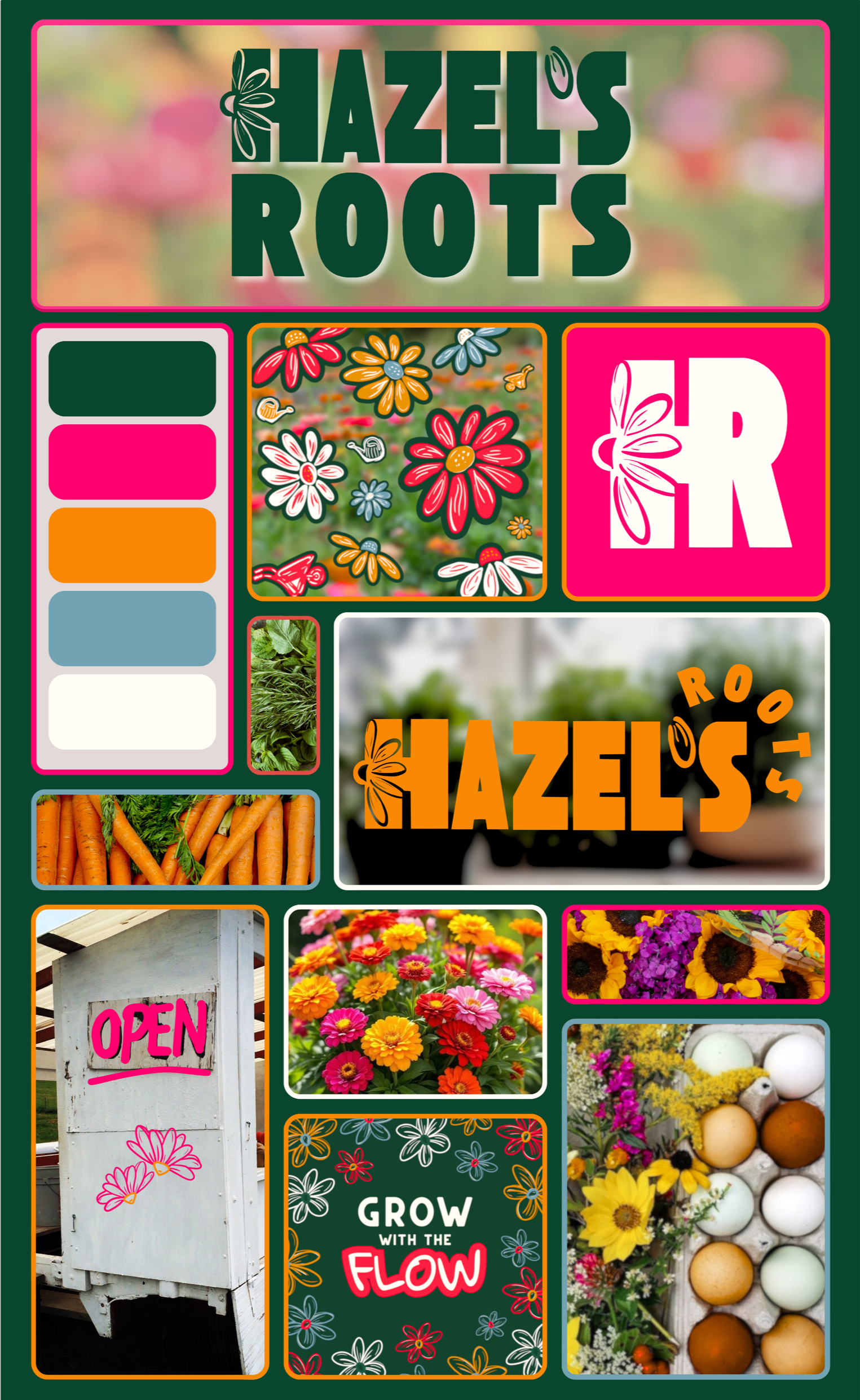
We built a flexible identity system designed to support Hazel’s Roots as it grows from a backyard stand into a recognizable local micro-brand.
The final brand balances youthful personality with practical functionality, allowing the visuals to adapt across signage, packaging, social content, and small-scale retail materials while remaining cohesive and easy to apply.


project outcomethe challengeHazel’s Roots began as a simple backyard flower stand with big personality and even bigger potential. The goal was to create a brand that felt playful and approachable while still working like a real small business identity system.
Because the stand operates on an honor-system model and serves neighbors, families, and passersby, the visual identity needed to feel welcoming, trustworthy, and easy to recognize at a glance. At the same time, it had to reflect the energy of a young grower learning entrepreneurship through flowers, garden goods, and seasonal offerings.
The challenge was designing a brand that could grow alongside the stand itself—supporting everything from handwritten price tags and roadside signage to social media posts, packaging, and future farmers market expansion—without losing its handmade charm.
project outcomeWe built a flexible identity system designed to support Hazel’s Roots as it grows from a backyard stand into a recognizable local micro-brand.
The final brand balances youthful personality with practical functionality, allowing the visuals to adapt across signage, packaging, social content, and small-scale retail materials while remaining cohesive and easy to apply.
wE BUILT:
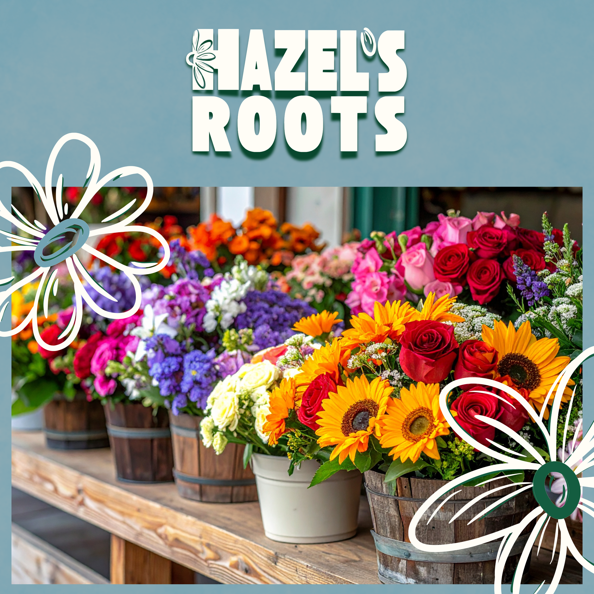
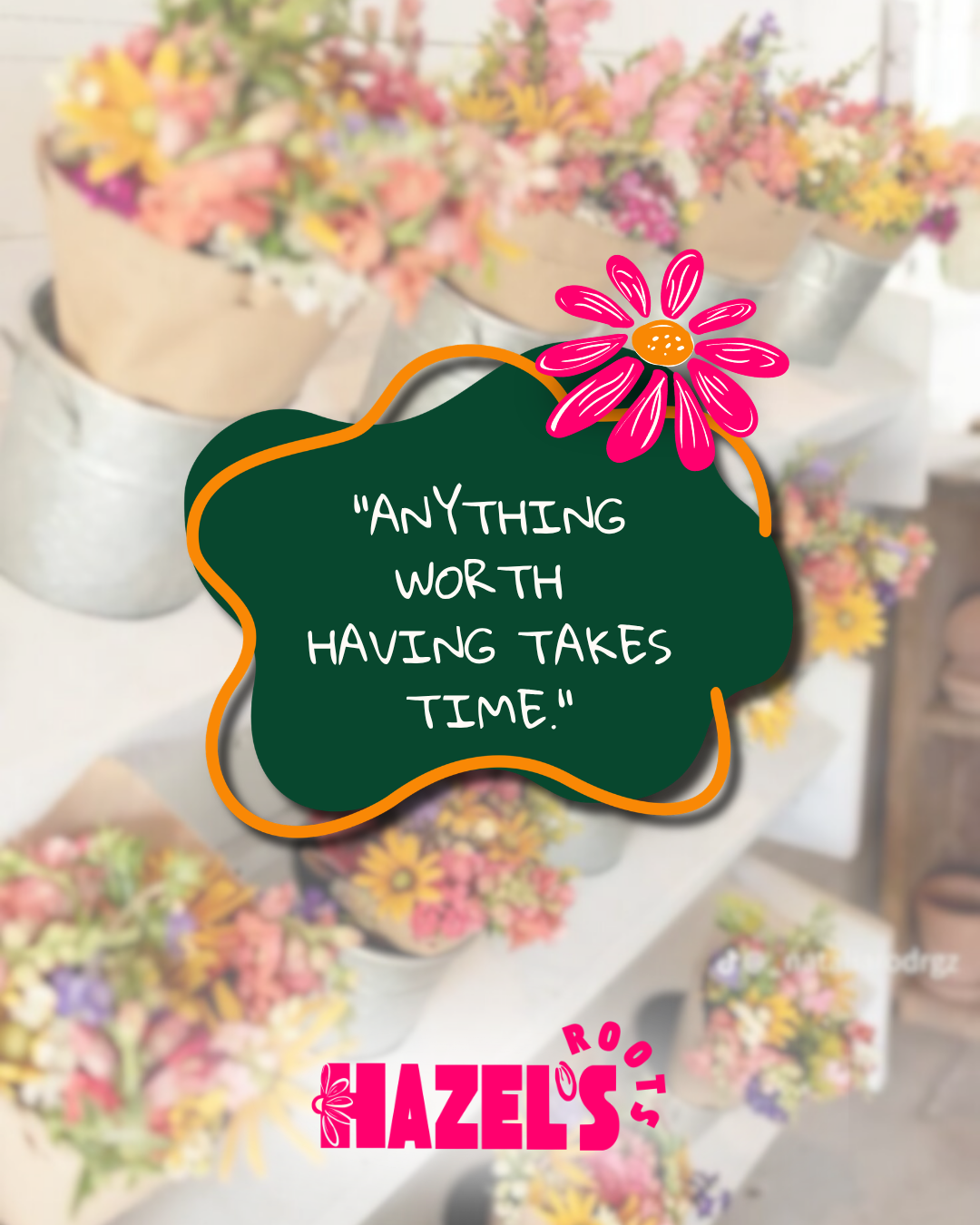
A cheerful primary wordmark designed for visibility on roadside signage, product tags, and social graphics
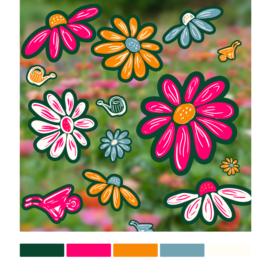
A custom illustration library featuring flowers, watering cans, and garden tools to create a recognizable visual language across materials
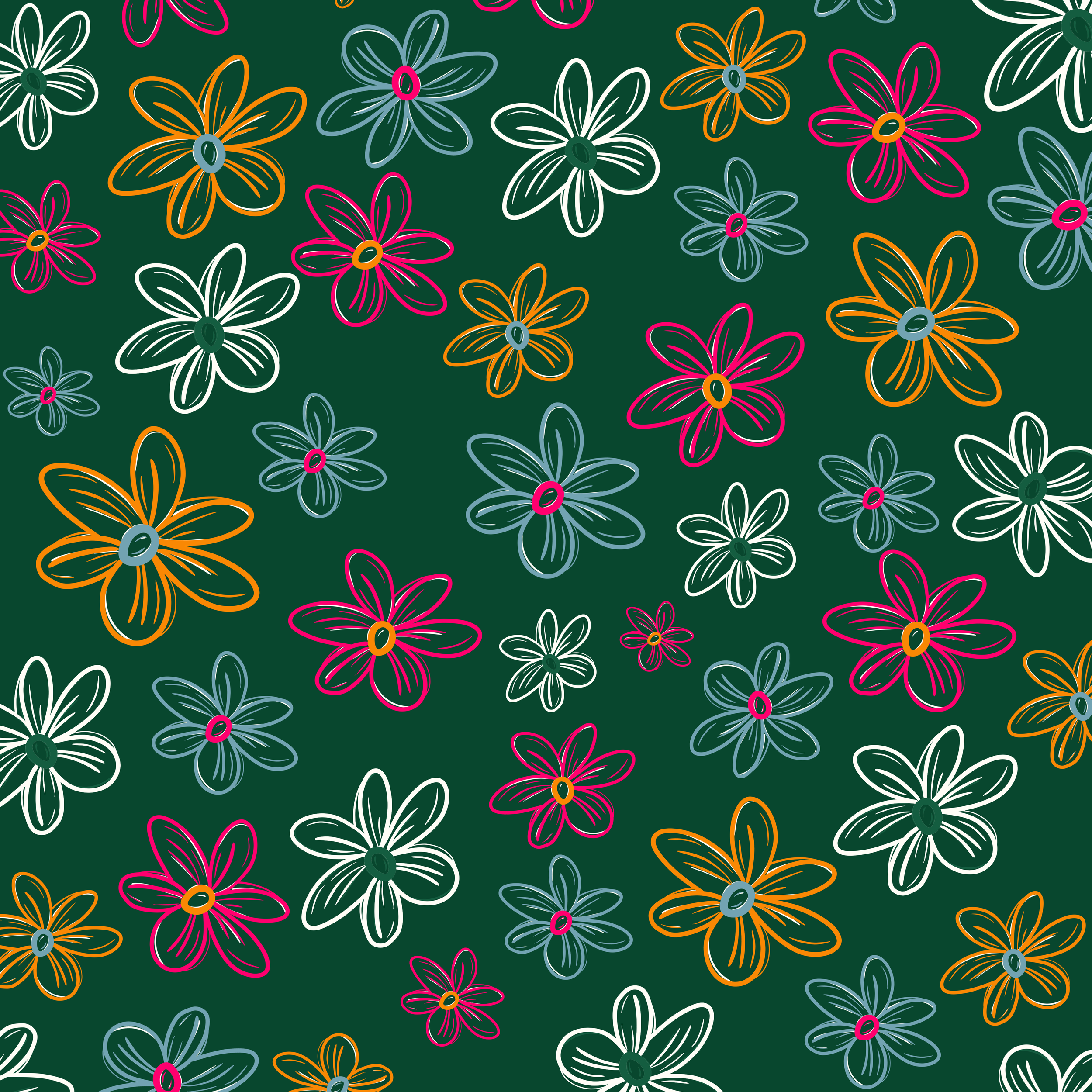
A bold, high-contrast color palette inspired by fresh blooms, garden greenery, and seasonal farm stand displays
A repeatable pattern system for packaging accents, background graphics, and environmental branding
Ready-to-use signage and micro-retail assets including bouquet tags, egg carton labels, QR payment signage, and honor-stand pricing cards
A social content style that supports weekly updates, seasonal announcements, and community engagement
Together, these elements create a brand that feels bright, local, and full of momentum—designed to grow alongside the stand as new products, markets, and opportunities take root.
A cheerful primary wordmark designed for visibility on roadside signage, product tags, and social graphics
A custom illustration library featuring flowers, watering cans, and garden tools to create a recognizable visual language across materials
A bold, high-contrast color palette inspired by fresh blooms, garden greenery, and seasonal farm stand displays
A repeatable pattern system for packaging accents, background graphics, and environmental branding
Ready-to-use signage and micro-retail assets including bouquet tags, egg carton labels, QR payment signage, and honor-stand pricing cards
A social content style that supports weekly updates, seasonal announcements, and community engagement
Together, these elements create a brand that feels bright, local, and full of momentum—designed to grow alongside the stand as new products, markets, and opportunities take root.
WE BUILT