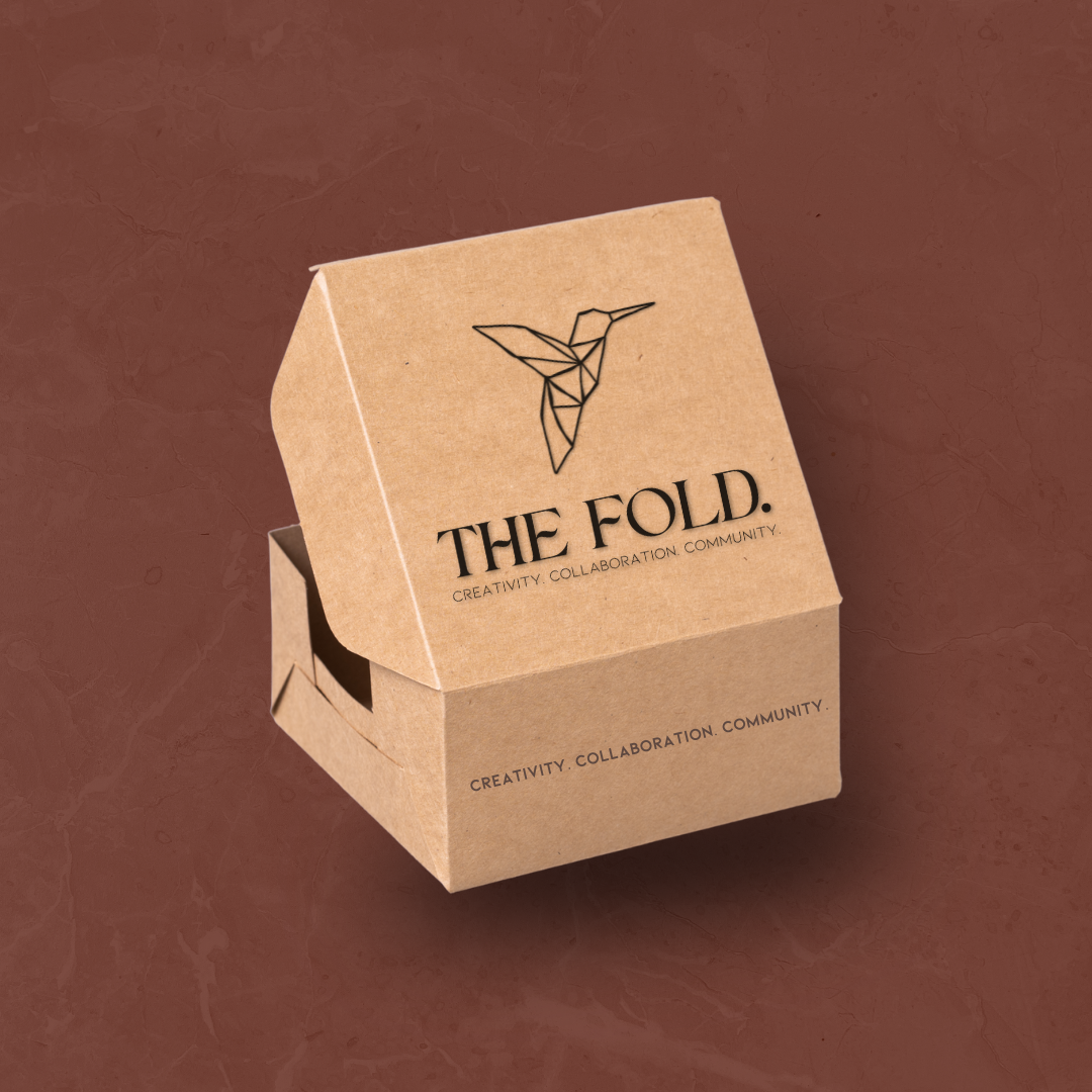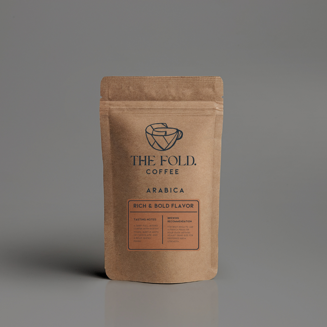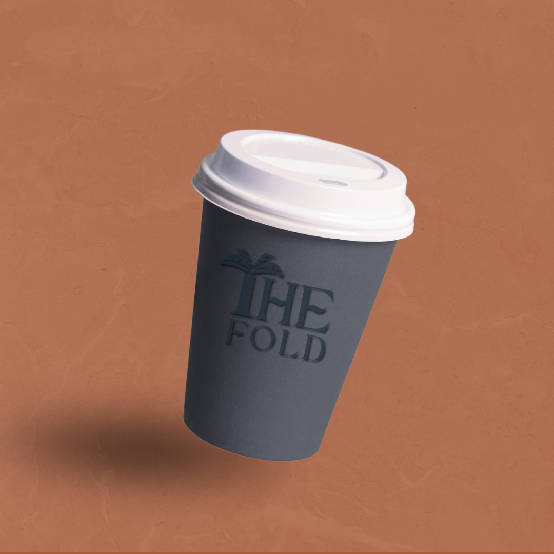
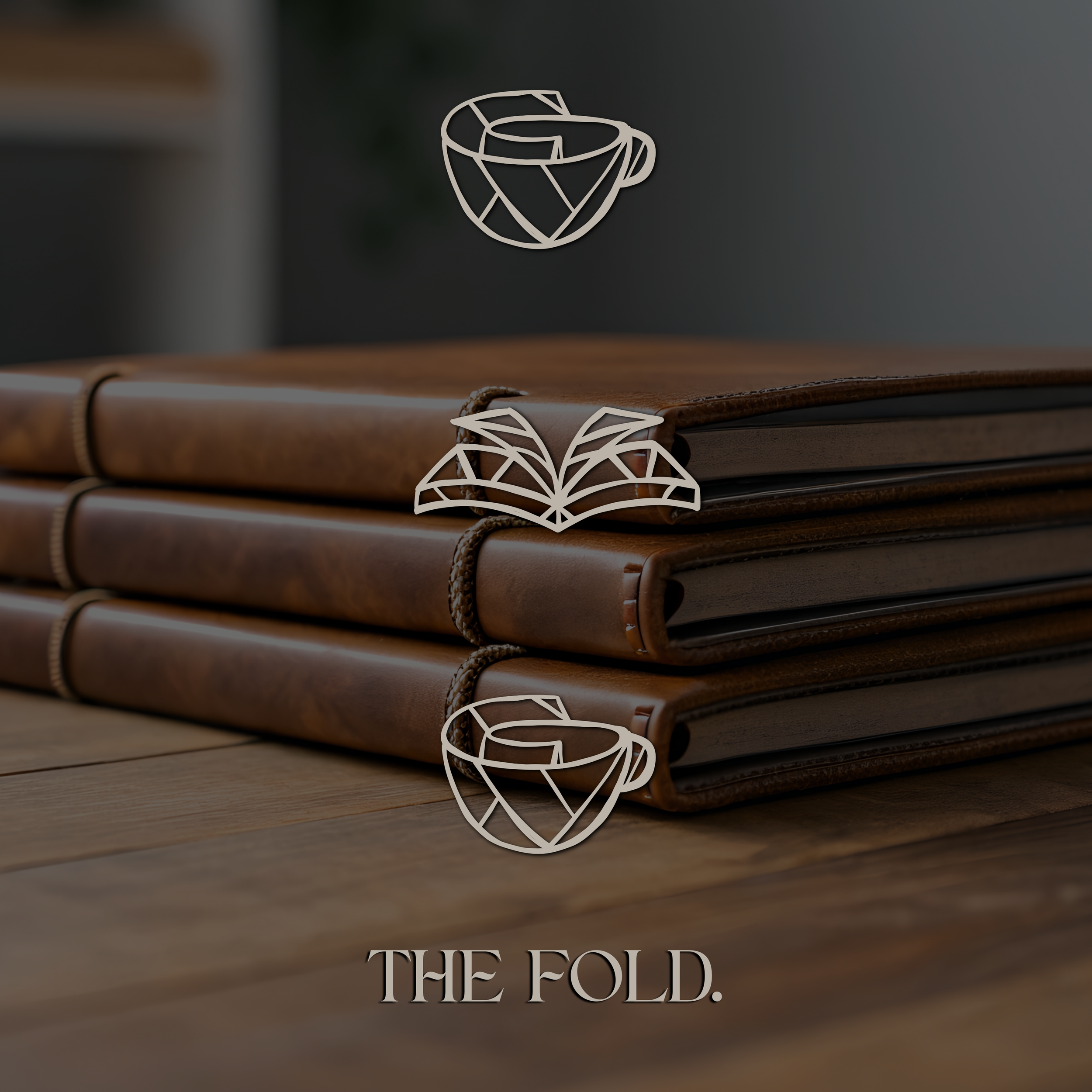
The Fold is a concept café and creative reading space designed to bring writers, thinkers, and slow-coffee people together in one quiet, intentional environment. The goal was to create a brand that felt editorial, tactile, and grounded—somewhere between an independent bookstore and a neighborhood café.
DILLY DAHLE CUSTOM RODS IS A STARTUP BUSINESS BASED OUT OF PRESTON IDAHO - SPECIALIZING IN CUSTOM FISHING RODS.
SERVICES
| BRAND identity | WEBSITE | launch support |
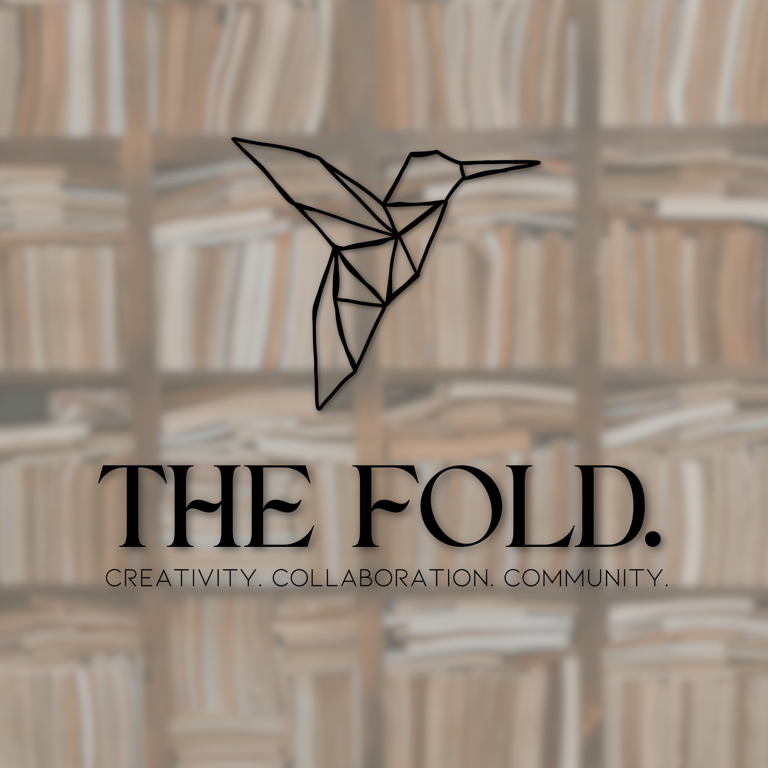
THE FOLD.
the fold.
SERVICES
| brand identity | WEBSITE | launch support |
The Fold is a concept café and creative reading space designed to bring writers, thinkers, and slow-coffee people together in one quiet, intentional environment. The goal was to create a brand that felt editorial, tactile, and grounded—somewhere between an independent bookstore and a neighborhood café.
The Fold needed an identity that could live comfortably between two worlds: literary and social. It had to feel thoughtful without being academic, warm without becoming rustic, and modern without losing its analog roots.
The brand required a flexible visual system that could support menus, packaging, social content, and in-store signage while still feeling quiet, cohesive, and recognizable.
wE BUILT:
A primary brand mark inspired by folded paper forms, supported by a custom icon family representing reading, conversation, and movement of ideas
A muted editorial color palette referencing paper stock, binding cloth, ink, and coffee tones
A flexible typography system suited for menus, packaging, signage, and digital use
A repeatable pattern library for environmental graphics and branded materials
A launch-ready visual toolkit designed to scale across social media, merchandise, and café packaging
THE CHALLENGE
project outcomethe challengeThe Fold needed an identity that could live comfortably between two worlds: literary and social. It had to feel thoughtful without being academic, warm without becoming rustic, and modern without losing its analog roots.
The brand required a flexible visual system that could support menus, packaging, social content, and in-store signage while still feeling quiet, cohesive, and recognizable.
project outcomeWe built a complete identity system designed to grow with the space as it evolved from café to creative community hub.
wE BUILT:
A primary brand mark inspired by folded paper forms, supported by a custom icon family representing reading, conversation, and movement of ideas
A muted editorial color palette referencing paper stock, binding cloth, ink, and coffee tones
A flexible typography system suited for menus, packaging, signage, and digital use
A repeatable pattern library for environmental graphics and branded materials
A launch-ready visual toolkit designed to scale across social media, merchandise, and café packaging